I was the frustrated user.
So I became the designer.
As a daily HSBC app user and frequent branch visitor, I watched people struggle with an app that hid its best features, exposed sensitive data on the homescreen, and forced users to call customer support for things that should take one tap. I redesigned the entire experience — from onboarding to payments — in 2 months.
Real users. Real frustration. Real app store reviews.
“Frustrating to pay monthly bills again and again”
App Store Review“Not able to track my expenses for the whole month”
App Store Review“It's really irritating to call customer support team for each and every thing when it is not discoverable on the app”
App Store ReviewRecurring problem: Navigation, content categorisation, and feature discoverability.
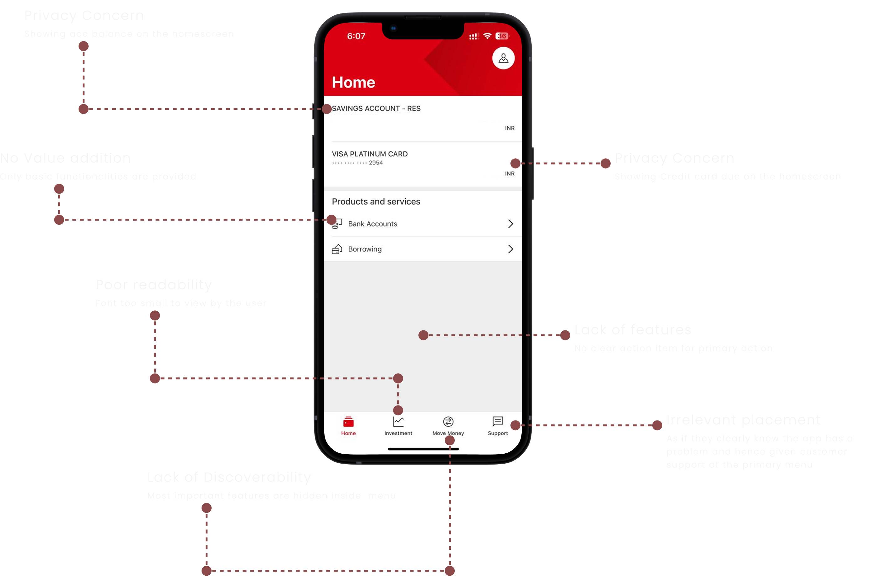
Six problems hiding in plain sight.
✕ Privacy concern
Account balance visible on homescreen. Credit card due exposed. No option to hide.
✕ Lack of discoverability
Most important features buried inside menus. Users couldn't find what they needed.
✕ No value addition
Only basic functionalities. No spend tracking, no analytics, no financial empowerment.
✕ Poor readability
Font too small. Information density without hierarchy. Scanning was impossible.
✕ No primary action
No clear CTA for the most-used feature — payments. Hidden behind multiple taps.
✕ Irrelevant placement
Customer support in the primary menu — as if they knew the app had problems and were pre-apologising.
Two personas. Two worlds. One broken app.
Sujoy Sengupta
26 · Business Analyst · Pune
Venkat Swamy
30 · Operations Manager · Bangalore
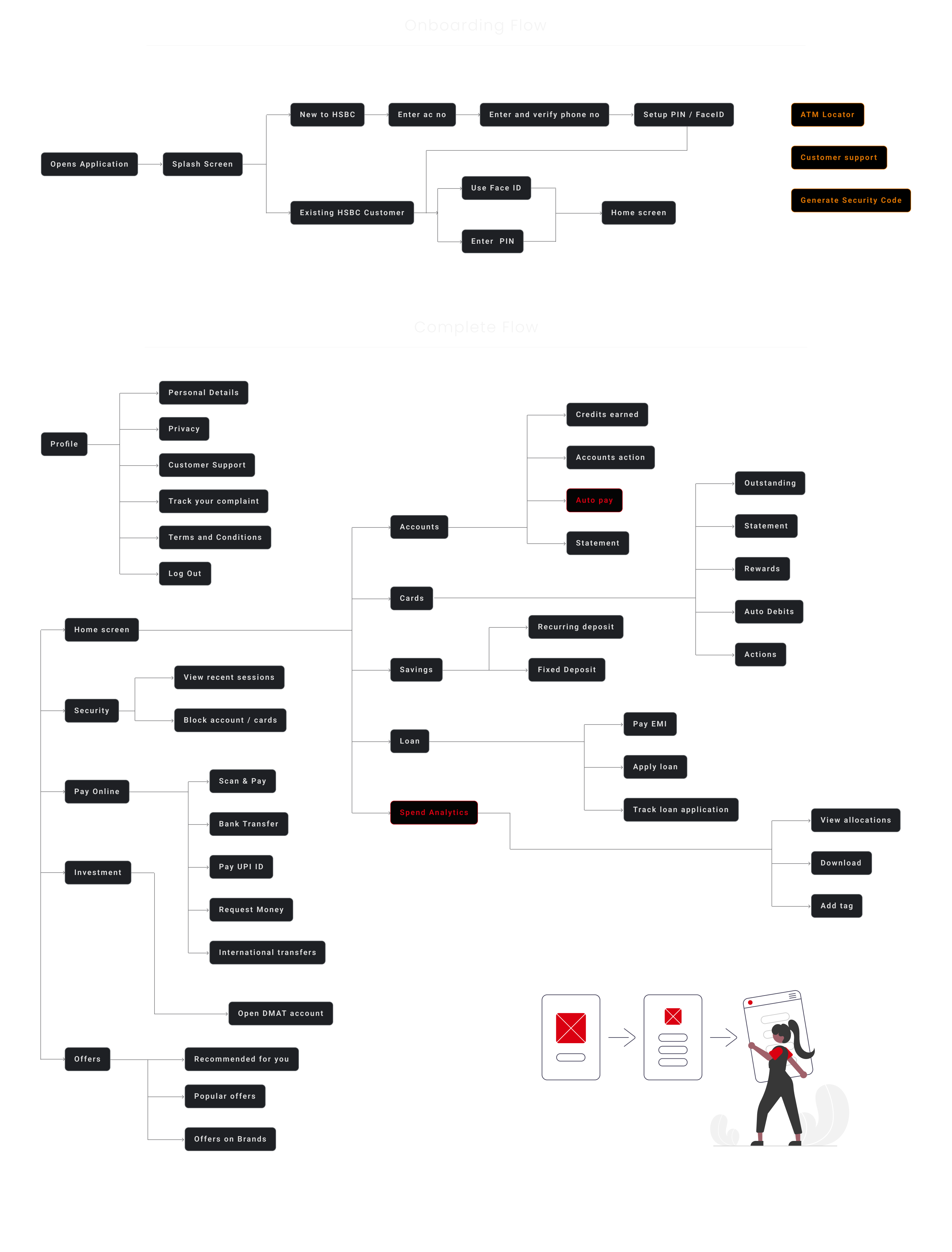
Persistent navigation. Because users move back and forth — not linearly.
Research showed users jumping between screens constantly. I used a persistent bottom menu — Home, Security, Pay Online, Investment, Offers — so the most important actions were always one tap away.
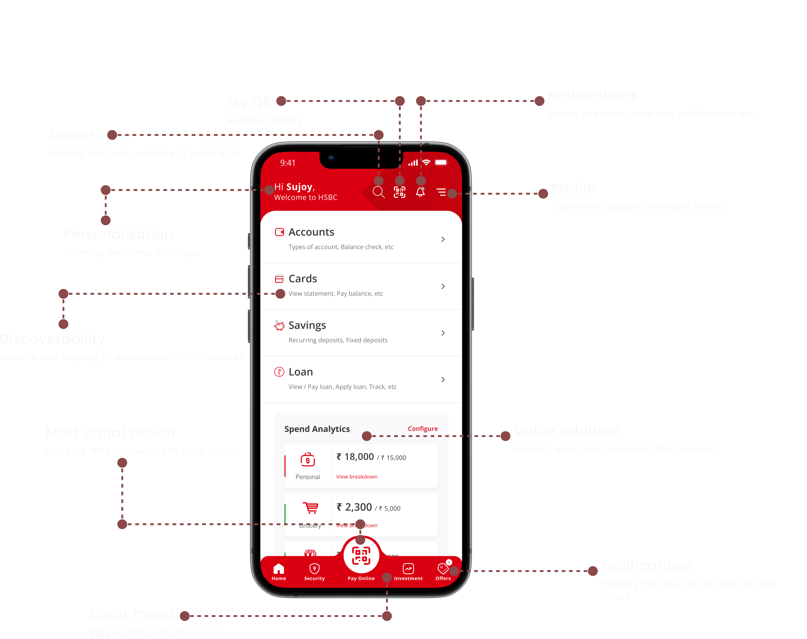
Every element earns its place.
Personalisation
Welcome message with user's name. The app acknowledges you before asking anything.
Most critical action front and centre
"Pay Online" moved to the primary position in the bottom nav. One tap to the most-used feature.
Spend Analytics on the home screen
Sujoy and Venkat both wanted spend visibility. Now it's the first thing they see — with configurable budgets.
Privacy by default
Balances hidden by default. Card numbers masked. Sensitive data only revealed on tap.
Discoverability through subtitles
Every menu item has a one-line description. Users know what's behind each tap before tapping.
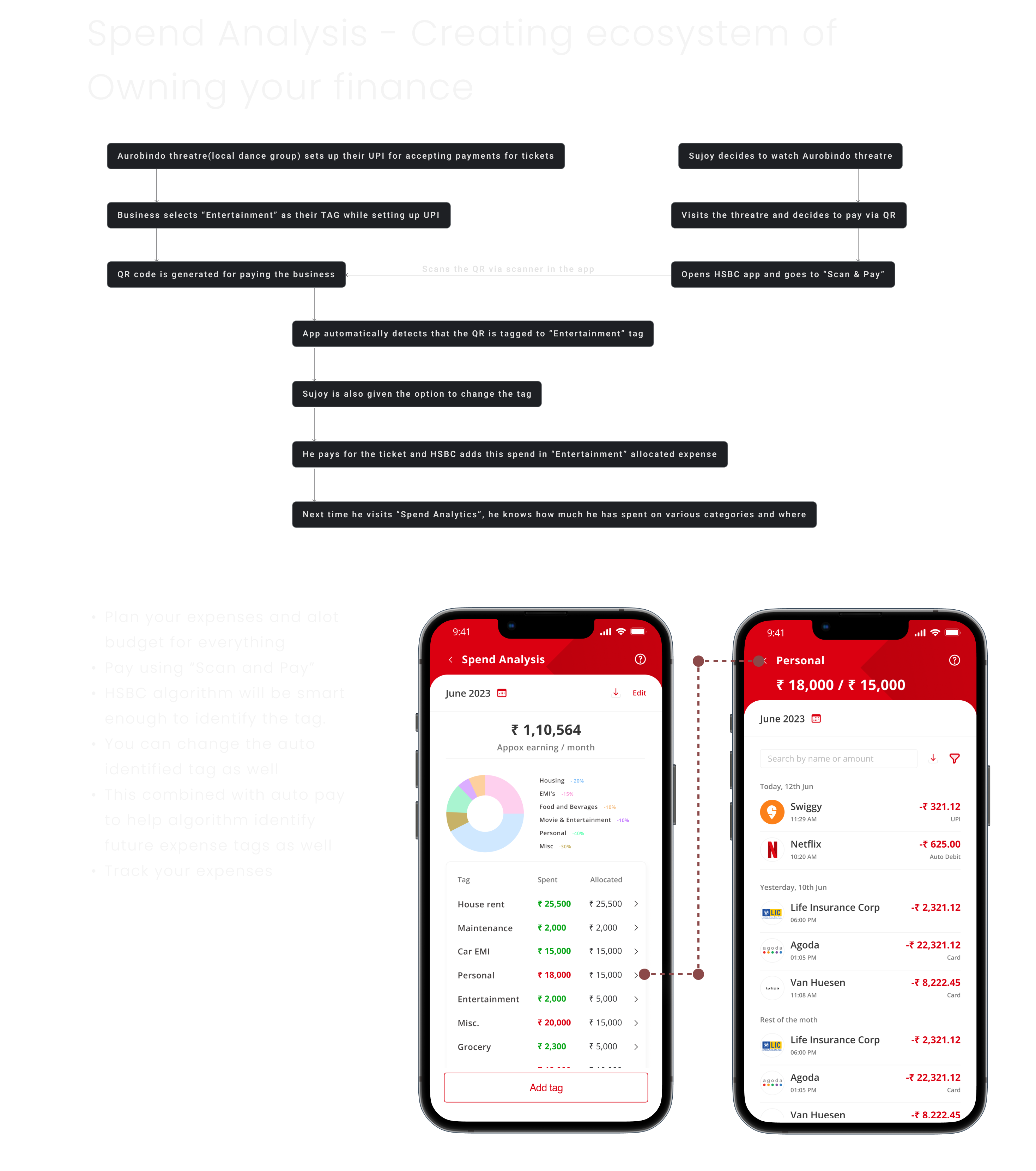
Spend Analytics — an ecosystem
for owning your finances.
This wasn't a feature request. Nobody asked for it. I designed it because Sujoy was living paycheck to paycheck without knowing where his money went.
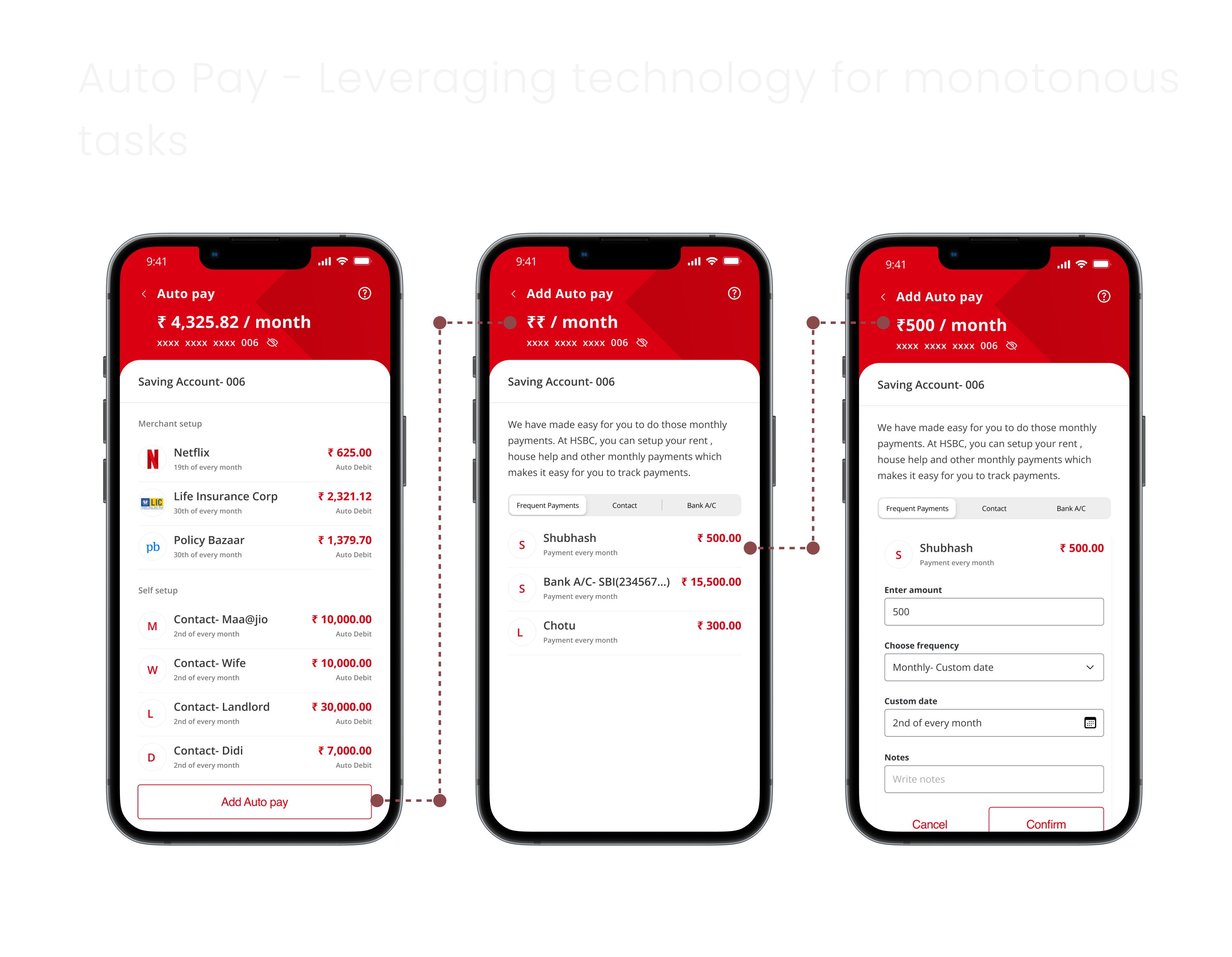
Every flow redesigned. Every edge case considered.
Cards
Clear credit/debit distinction. Rewards with redeemable vs processing points. EMI conversion on any transaction. Block card without calling support.
Pay Online
Scan & Pay as primary action. Personal QR for receiving. Torch for low-light scanning. Self-identifying transaction tags.
Accounts
Balance hideable. Credits earned this month visible. Tagged transactions for spend analysis. Statement with transaction-level detail.
Offers
Three categories: recommended (personalised), popular, brand-specific. Can't redeem without contacting support? Fixed — one tap redemption.
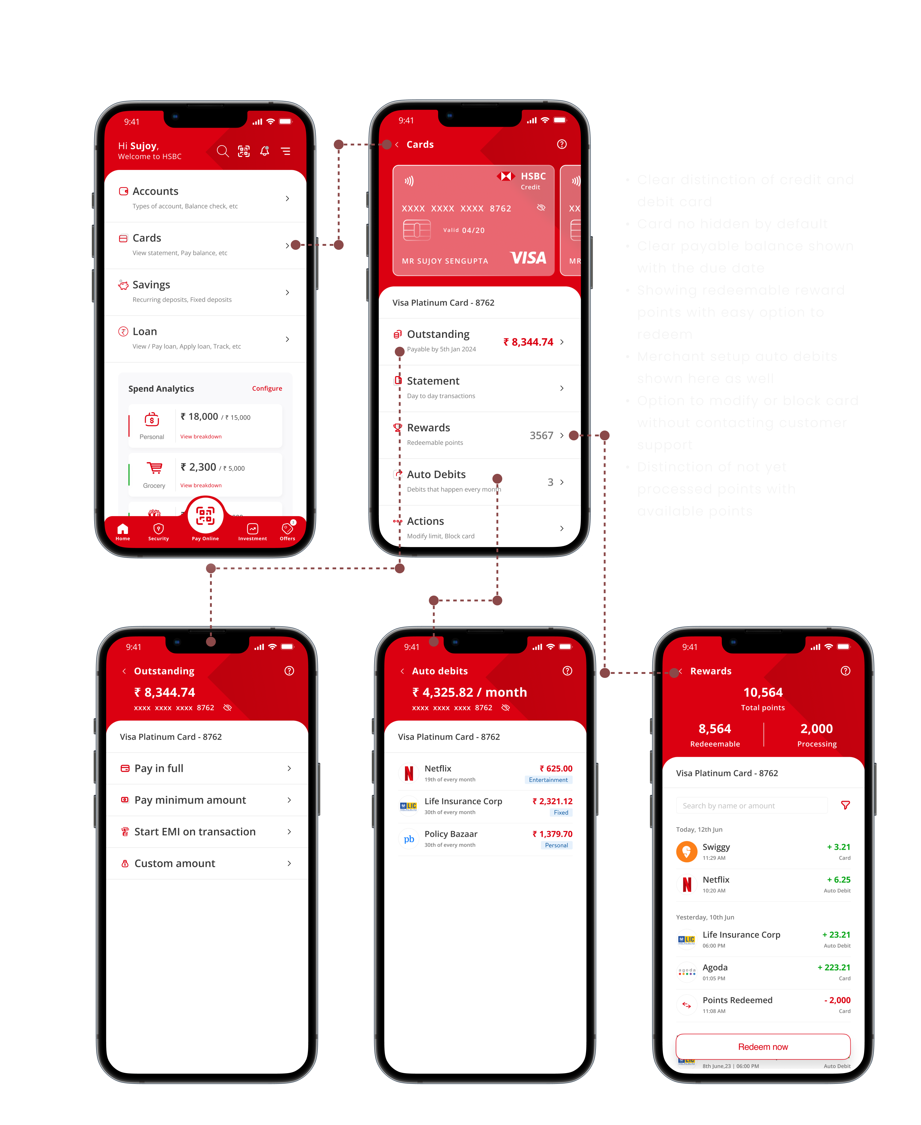
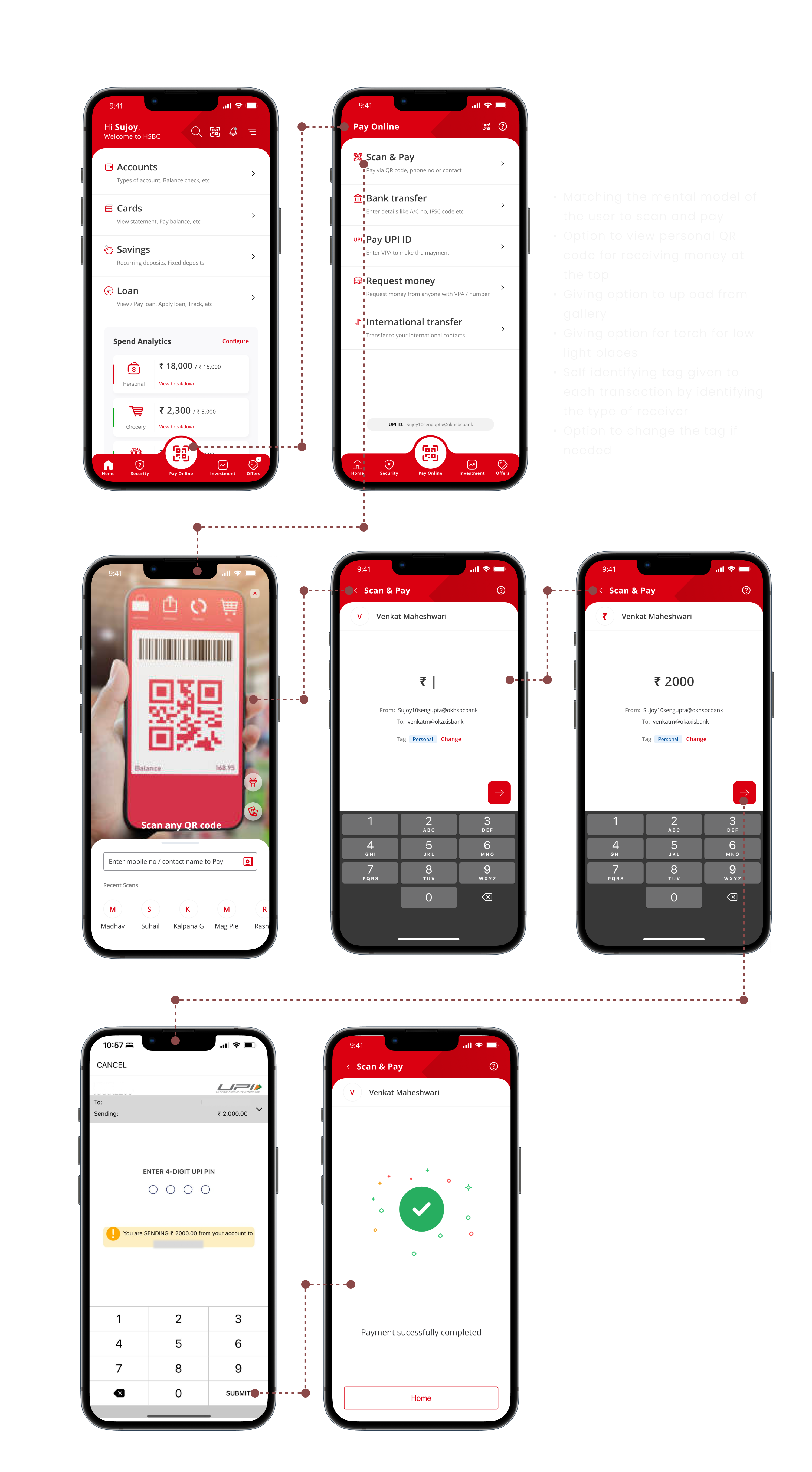
Three tests. All passed.
Hallway Testing
Tested with avid HSBC users. They completed all tasks they wanted to do. Loved the new approach.
Expectancy Test
Verified that the user's mental model matched the conceptual model of the new design.
Reverse Card Sorting
Validated information architecture was acceptable and intuitive to the target audience.
Users were able to perform all the tasks they wanted to do. The navigation made sense. The features were where they expected them. The mental model matched.
Be the user first
My deepest insights came from being frustrated with the app myself. Empathy isn't a workshop exercise — it's lived experience.
Design what nobody asked for
Spend Analytics wasn't in any brief. It came from watching Sujoy struggle. The best features come from observation, not requirements.
Privacy is a design decision
Hiding balances by default isn't a feature toggle. It's a statement about who the app respects — the user, not the dashboard.
Consumer UX demands different muscles
Enterprise design rewards systems thinking. Consumer design rewards emotional precision. Both are craft — different instruments, same discipline.
The best redesigns don't just fix what's broken.
They reveal what was always missing.