Harley
“Ok so, this seems odd. Let me share it with Deepti to see her opinion.”
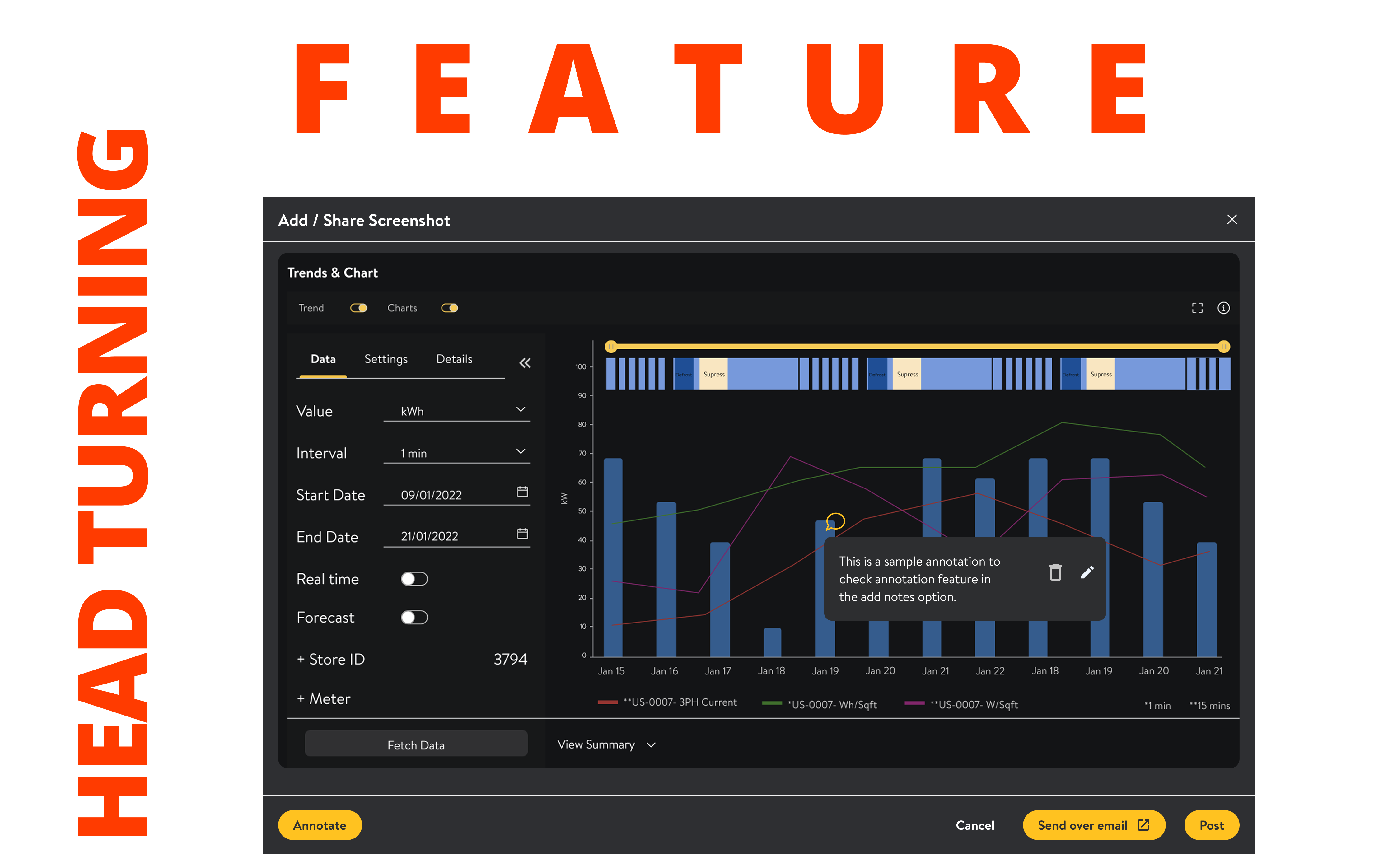
Opens Notes → clicks Add Screenshot → annotates the suspicious timestamp directly on the chart.
Across thousands of Walmart stores, IoT sensors monitor refrigeration, HVAC, lighting, and equipment 24/7. When something goes wrong, an energy analyst has minutes to diagnose it — or the alert ages into a work order, the work order becomes product loss, and the product loss becomes wasted electricity. $400 million a year was on the line. The tools were the bottleneck.
Energy Analyst · 32 · Bentonville, Arkansas
Santiago is an expert. He knows his domain cold — refrigeration cycling, compressor anomalies, HVAC patterns. He doesn't need the system to teach him. He needs it to stop getting in his way.
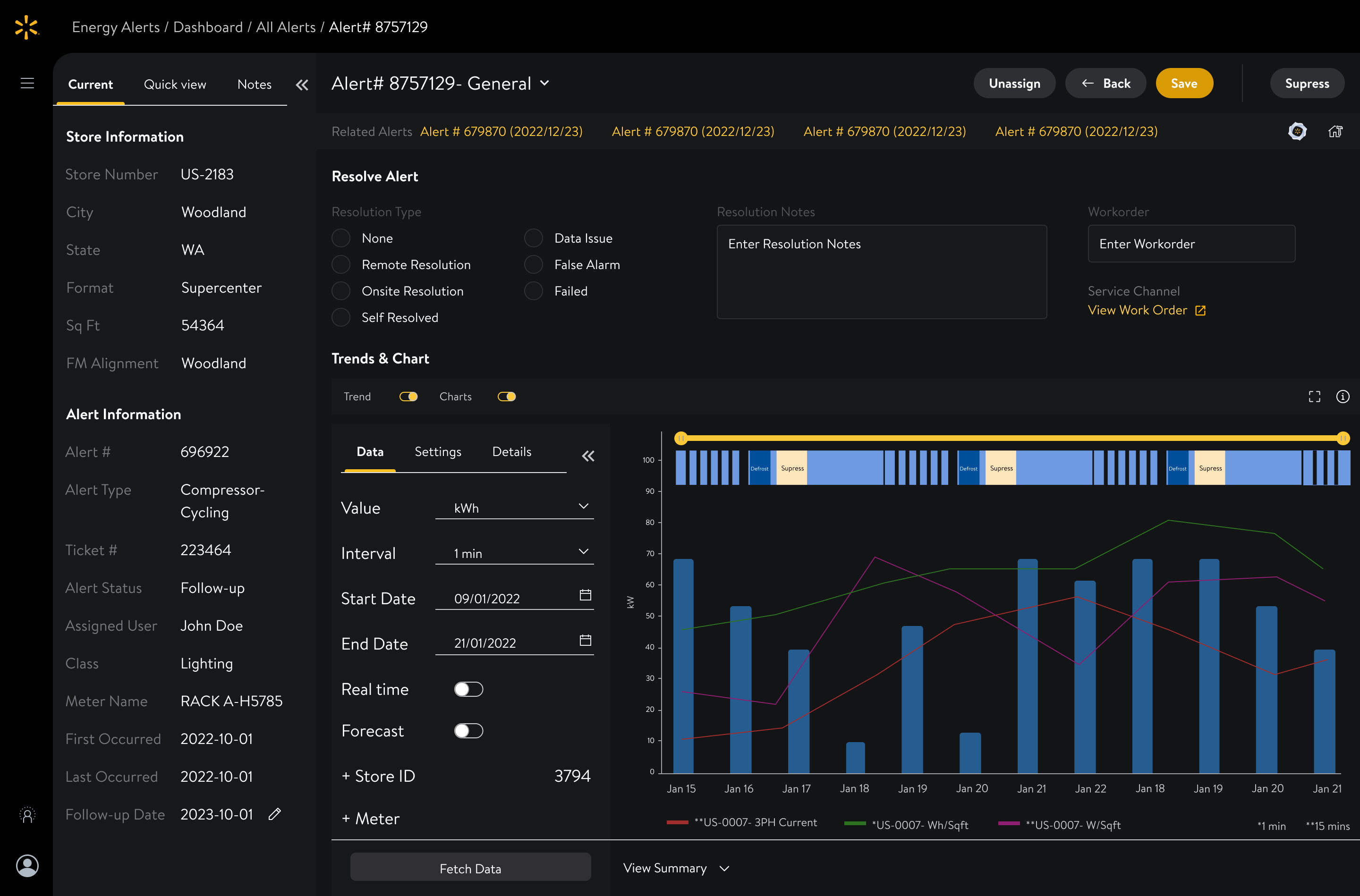
The graph — the most important tool — was squeezed into a corner. No room to think.
→ Collapsible segments + full-screen chart mode. The UI adapts to the investigation.
Same root cause, five separate tickets. Santiago resolved one. Someone else resolved another. Nobody knew.
→ Auto-grouping related alerts into one ticket. One resolution for all. 39% fewer alerts overnight.
Data lived in one tab, notes in another, the graph in a third. Close one by accident — start over.
→ Everything on one page. Graph overlay to compare multiple series without switching.
Screenshot the graph. Open Outlook. Paste. Write context. Hope they understand. They usually didn't.
→ Annotated screenshot sharing with auto-drafted email + deep link to exact alert with same filters.
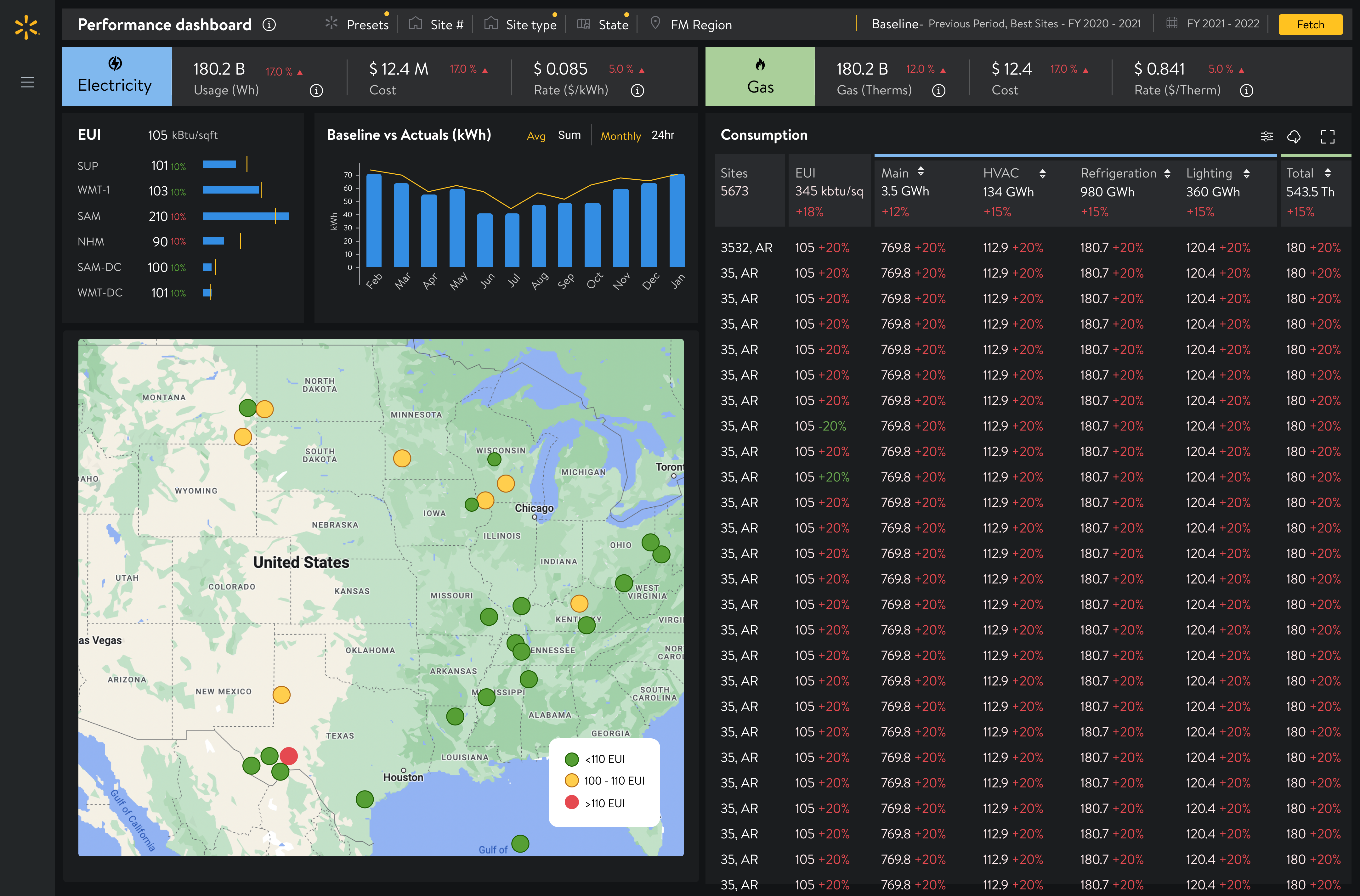
It looked like a proper enterprise dashboard. It ate the real estate analysts needed for actual investigation. Users didn't care how their team was performing — they needed space to diagnose their own alerts.
The screen belongs to
the investigation.
Not the dashboard.
“Ok so, this seems odd. Let me share it with Deepti to see her opinion.”
Opens Notes → clicks Add Screenshot → annotates the suspicious timestamp directly on the chart.
Auto-drafts an Outlook email with the annotated screenshot + a deep link to this exact alert with the same filters Harley was using.
One click. Zero manual context-building.
“Harley needs my help. Let me open and check this alert.”
Clicks the email link → lands directly on the alert with Harley's filters preserved → analyses → adds her comment in the notes panel.
Screenshot → Outlook → paste → write context → hope they understand → they don't → call → explain → re-share.
Annotate → one click → Deepti lands on the exact same view. The investigation never breaks.
Santiago didn't need onboarding. He needed speed. The best design decision was getting out of his way and giving him every pixel for investigation.
Harley and Deepti were already collaborating — just badly. The work wasn't inventing collaboration. It was removing the friction from what they were already doing.
The metrics bar looked impressive in reviews. A/B testing killed it in 48 hours. Testing saved us from our own instincts — and gave the screen back to the investigation.
Every pixel given to decoration was a pixel taken from the analyst's investigation. In operational tools, space is the most valuable design material you have.